On August 12 the Bureau of Labor Statistics reported that consumer prices rose 3.4% over the past twelve months, down from 3.5% in June. Core inflation came in at 2.5%, the slowest annual pace since 2021. Stocks hit a record high. CNN's Fear and Greed Index sat at 65, well inside greed territory.
Underneath the article announcing all this, someone left a comment that summarized the entire day better than any of the coverage did.
Stock owners: "Great, my portfolio is up."
People struggling with prices: "Who cares? Everything is still expensive."
Comment on Seeking Alpha, August 13, 2026
Both of those people read the same report. Both of them are right. The reason they can both be right is the single most misunderstood thing about inflation reporting, and it has a direct consequence for how you should think about your own grocery budget.
Disinflation is not deflation
When the inflation rate falls from 3.5% to 3.4%, prices did not go down. Prices went up more slowly. The rate of increase decelerated. The level, which is what you actually pay at the register, kept climbing.
This distinction sounds pedantic until you look at what it compounds into. Here is the grocery price index for July of every year since 2019.
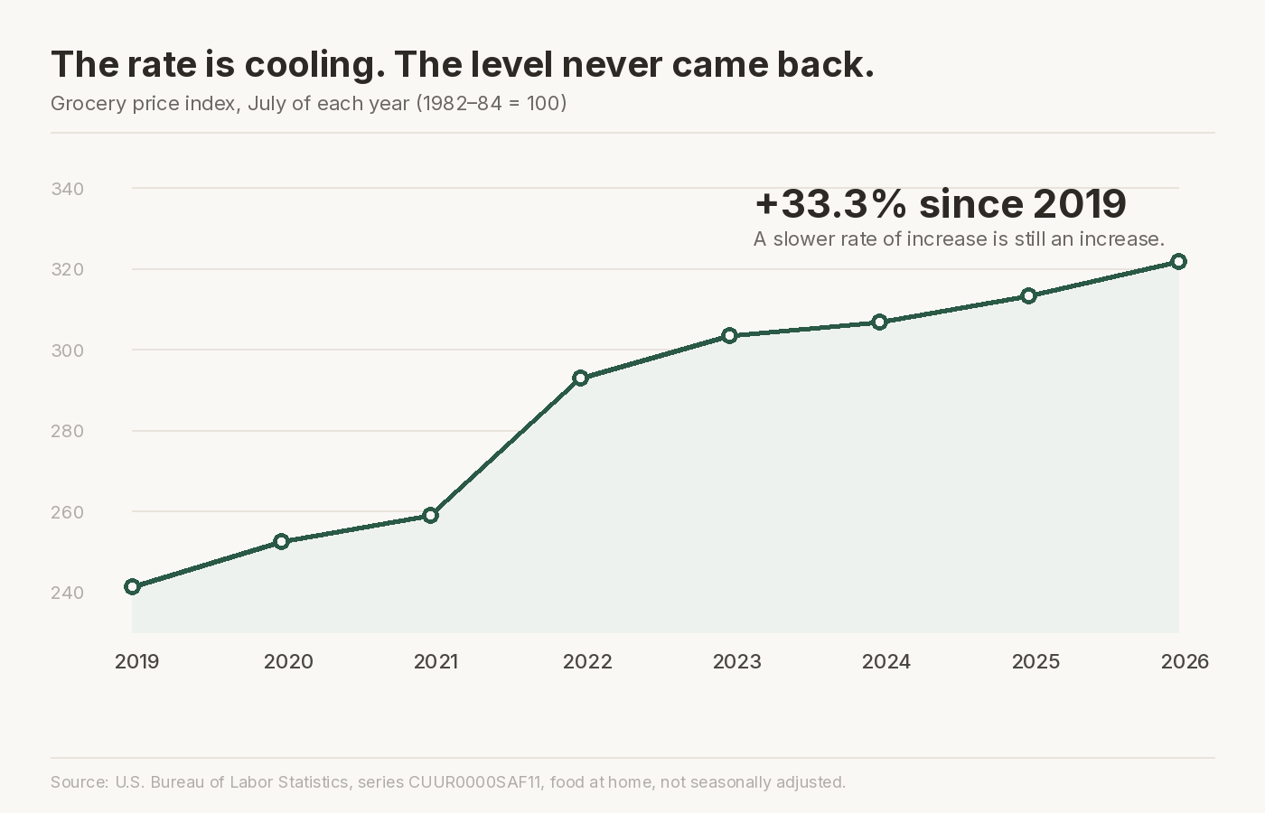
Groceries are 33.3% more expensive than they were in July 2019. Overall consumer prices are up 30.1% over the same stretch. Neither line has ever gone down for a full year. The 2022 spike everyone remembers did not reverse when inflation "came back under control." It became the new floor, and prices kept building on top of it.
Another commenter under that same article ran the arithmetic on why this matters over a longer horizon. At 2% annual inflation, prices rise 21.9% over ten years. At 3%, they rise 34.4%. That single percentage point of difference compounds into a 12.5 point gap in the total price level. It is the difference between a $200 grocery run becoming $244 and becoming $269.
So when the headline says inflation cooled and your reaction is that nothing feels cheaper, your reaction is correct. Nothing is cheaper. Things got more expensive at a slightly slower rate.
"Groceries up 2.7%" is hiding a 38-point spread
Food at home rose 2.7% over the last twelve months, and actually dipped 0.1% in July itself. On its face, that is the calmest grocery reading in years.
But that 2.7% is a weighted average of a fixed national basket. Open it up and the individual categories inside it are nowhere near each other.
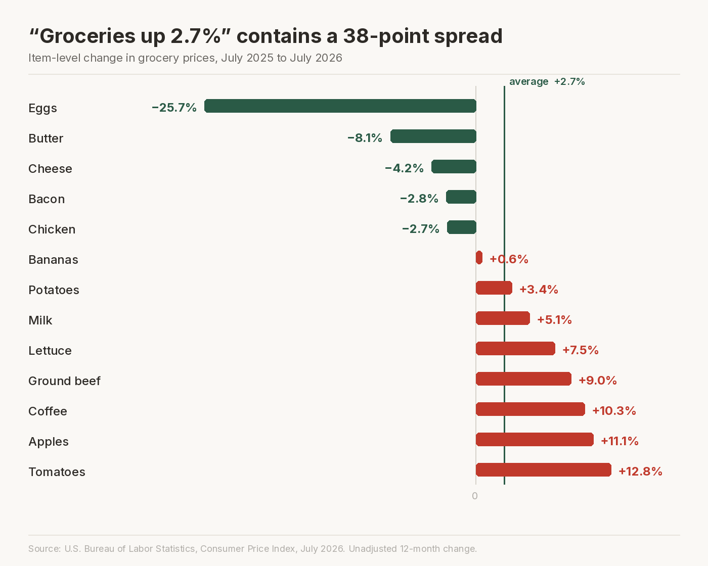
Eggs are down 25.7% from a year ago. Tomatoes are up 12.8%. Apples are up 11.1%, coffee 10.3%, ground beef 9.0%. Butter is down 8.1% and cheese is down 4.2%. The distance between the cheapest and most expensive item on that list is 38.5 percentage points, all averaged together into a single figure that reporters then describe as what happened to groceries.
The averaging happens at every level, not just the top. Dairy as a whole came in at negative 0.5%, which sounds like nothing happened. Inside it, milk rose 5.1% and cheese fell 4.2%. Two staples in the same aisle moved nine points apart and the category number reports approximately zero.
Think about what that means for two real households.
A family that eats a lot of eggs, chicken, cheese, and bacon genuinely experienced grocery deflation this year. Their bill is lower and they may not have consciously noticed. A household built around coffee, ground beef, tomatoes, and apples is running close to 10%, roughly four times the reported rate, and they are being told by every news outlet in the country that groceries only went up 2.7%.
Same country. Same month. Same report. The average is accurate and it describes neither of them.
We wrote about this dynamic back in July using one person's receipts. The July CPI release is the same argument made with the government's own data.
Wondering which of those two households you are? That answer is already sitting in your receipts. BiteSpend reads them and builds your own price history, item by item, at the stores you actually shop. Free on iOS and Android, and it never asks for your bank login.
Eating out got more expensive than eating in
One line in the report deserves more attention than it got. Food away from home rose 3.4% over the year. Food at home rose 2.7%.
Restaurants inflated faster than groceries, and they have been doing so consistently, because restaurant pricing carries labor costs that grocery pricing largely does not. Full service meals rose 3.4%. Limited service, which is fast food, was in the same neighborhood.
The practical read is that the cost advantage of cooking at home widened again this year. If you were looking for the single highest-leverage change available in a food budget, it is still the same one it has always been, and the gap just got slightly bigger.
The container got smaller and the receipt still knows
A third comment on that article raised something the CPI genuinely struggles to communicate:
"When Mr. and Mrs. America goes to the store they don't know what the inflation print is, and saying CPI came down makes it sound like the economy has sounded the all clear. It's the compounding effect of inflation that keeps prices high, and the shrinking of the container your goods come in."
Comment on Seeking Alpha, August 12, 2026
Shrinkflation. The BLS does account for it, and this is worth being precise about, because it is frequently claimed that they do not. When a package goes from 16 ounces to 14 ounces at the same price, CPI methodology treats that as a price increase, because the index tracks price per unit of quantity rather than price per package.
So the statisticians catch it. The problem is that you do not. You see the same box at the same price and register no change, while your household burns through it faster and you buy it more often. The increase shows up in your annual spending, not in any single moment where you noticed a price go up.
This is precisely the kind of thing a receipt captures and memory does not. The unit price is printed right there, next to the item, on a piece of paper you throw away within about three seconds of walking through the door.
On not believing the numbers
A meaningful share of the comments under that article were some version of "who believes these numbers." That sentiment is widespread and it is worth engaging with honestly rather than dismissing.
Here is our view. The CPI methodology is public, documented in detail, and produced the same way it was produced under previous administrations of both parties. We have no reason to think the arithmetic is falsified, and we are not going to pretend otherwise for the sake of agreeing with an audience.
But the gap people feel between the official number and their own life is real, and it does not require any conspiracy to explain. It comes from four ordinary sources:
- Your basket is not the national basket. The 38-point spread above is the whole story. The index weights every category by national consumption, not yours.
- Your region is not the national average. CPI is a national composite. Regional and metro-level price movement varies substantially around it.
- You feel the level, the index reports the rate. Seven years of compounding is what your budget experiences. The 12-month change is what gets a headline.
- You remember increases, not decreases. Eggs fell 25.7% and almost nobody noticed. Coffee rose 10.3% and everyone did. This is a well-documented feature of how humans track prices, and it is not a character flaw.
The useful response to all of this is not to argue about whether the national number is right. It is to stop relying on the national number to describe your household, because it was never designed to.
What to actually do about it
You cannot control CPI. You can measure your own, and the raw material is already in your hand every week.
The exercise is straightforward in principle. Take the fifteen or twenty items you buy most often. Compare what each one costs today against what it cost six or twelve months ago at the same store. Weight each by how much of it you actually buy. That weighted number is your personal grocery inflation rate, and it is the only inflation figure that describes your budget.
Nobody computes this for you. BLS computes a national composite. Your bank sees a merchant total and a dollar amount, which is why a bank app cannot tell you what happened inside an $87 Target run. Budgeting apps built on bank feeds inherit the same blindness, because the feed carries the transaction, not the line items.
The item-level history has to come from the receipt. There is no other consumer-accessible source for it.
What this looks like in practice
We built BiteSpend to do this specific job. You photograph a receipt, it extracts every line item in a few seconds, and over a few months of scanning it accumulates enough history to tell you which items at your store have actually moved.
That output looks nothing like a CPI table. It looks like this, from one real store over six months:
From the BiteSpend same-store price movement card, computed from actual scanned receipts at one store. One shopper's data. Results vary by location and shopping pattern.
Those swings are far larger than anything in the CPI report, and that is the point. National averages are smooth because averaging thousands of stores is what makes them smooth. Your actual shelf is not smooth. It is volatile, and some of that volatility is seasonal noise you should wait out while some of it is a permanent repricing you need to adjust to. You cannot tell which without a history.
Disclosure: we build this app, and the store data above is one shopper's. We are showing it to illustrate the size of the gap, not to claim it is representative.
The honest summary of the July report
Inflation is cooling. That is real and it is genuinely good news, and the market's reaction to it is rational on its own terms.
Prices are not falling. Groceries are 33.3% more expensive than they were seven years ago and that is not coming back. Within this year's calm-looking 2.7%, individual items ranged from eggs at down 25.7% to tomatoes at up 12.8%, which means the reported figure describes almost nobody's actual cart.
Both things are true at once. Markets trade the rate of change. Households live at the price level. That is the whole reason two people can read the same report and reasonably conclude opposite things.
The number that matters for your budget is not in the report. It is in the pile of receipts you have been throwing away.
Find out what your number actually is.
Scan a receipt and BiteSpend starts building your own price history, item by item, at the stores you actually shop. Free to start, no bank linking.
Download on the App Store Get it on Google PlaySources. U.S. Bureau of Labor Statistics, Consumer Price Index news release for July 2026, published August 12, 2026, and series CUUR0000SAF11 and CUUR0000SA0 for historical index levels. Market sentiment reading from CNN's Fear and Greed Index, August 14, 2026. Reader comments quoted from the Seeking Alpha news item on the July CPI release. This post describes economic data and household budgeting. It is not investment advice.